The United Nations Climate Change Conferences are yearly conferences, with more than 23 Conferences were held by 23 countries. Its aim is to serve as the formal meeting of the United Nations Climate Change Conferences Parties to assess progress in dealing with climate change. But when I reviewed these years’ branding design of the conference, those designs are too common and boring. Hence, I decided to rebrand the conference’s identity design. The objective of this project is to create an attractive branding that can reflect the connection between the different weather and the global climate change.
Long Description
Check more details:
https://www.behance.net/gallery/35944337/COP-25th-Global-Climate-Change-Conference
Check the research process: https://issuu.com/shangningwang/docs/design_for_global_climate_change
This project has no affiliation with COP’s brand. Global Climate Change is not a new topic. Our governments have plans to resolve it for years, but they did not have many actions. Most of people gradually lost their interest on this topic. As designers, we have the ability and responsibility to arouse people’s interest again. I hope this project can inspire other designers.“Design can save the world! ”.
The United Nations Climate Change Conferences are yearly conferences, with more than 23 Conferences were held by 23 countries. Its aim is to serve as the formal meeting of the United Nations Climate Change Conferences Parties to assess progress in dealing with climate change. But when I reviewed these years’ branding design of the conference, those designs are too common and boring. Hence, I decided to rebrand the conference’s identity design.
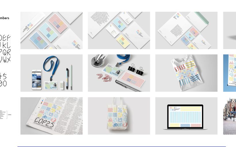
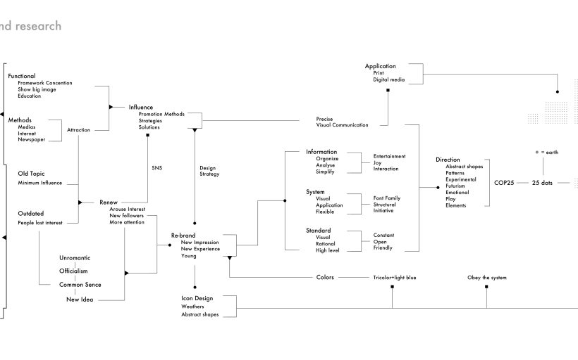
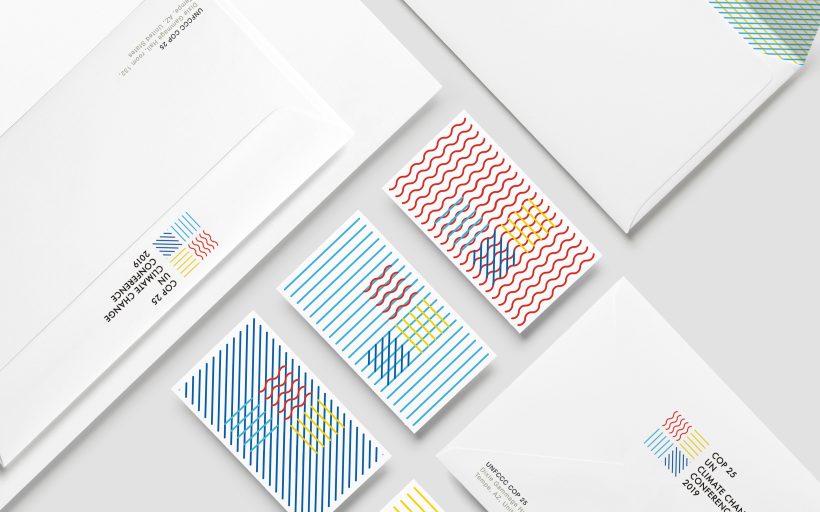
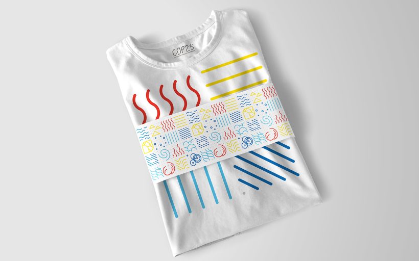
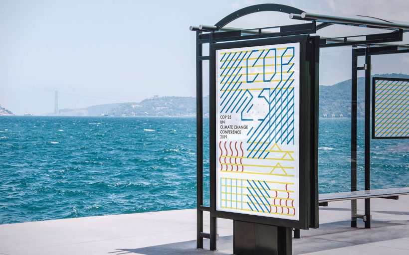
The objective of this project is to create an attractive branding that can reflect the connection between the different weather and the global climate change. The first step is to build the identity’s visual system. The visual system is made by 25 dots which relates to the 25th COP Conference. My aim is to create a smart system that can be applied on different medias. I abstracted the media’s characteristics and fitted them to the system. From printings to screens, each individual design can reflect the media’s character.
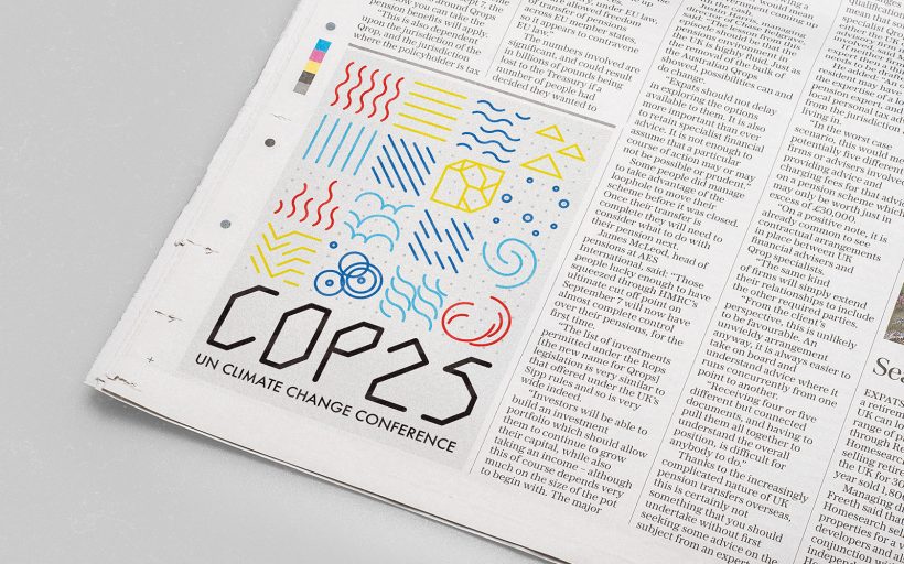
In order to create a scalable and flexible identity, I explored composition on the weather icons. All the icons are developed in the system. The identity communicate the conference’s goals and the concept of weathers mix. Since the weather conditions are never independent.
In addition, different weather conditions are mutual conversion among each other. Through designing a simple visual system, I can make these icons reasonably showed at the same time. The main logo is composed by the four basic elements of nature. They are air, water, earth, and fire. Except for the square made by 25 dots, the four elements are the foundation for the system. All the weather icons are developed from the four basic elements. In the process, I also developed a typeface family that can be combined accurately with the whole visual system.
For secondary logo, I chose Futura Medium. The new identity design is more friendly and interesting for young generations. It is good for the conference’s promotion and influence . A right design strategy can help the conference attract more followers.
Design can save the world! Thank you for watching!



Share on social media.
Facebook
Twitter
LinkedIn
Mail